Seven Thumbnail Mistakes That Quietly Sink Your Click-Through Rate
A video can be well shot, well written and well paced, and still land in front of nobody. That is not a mystery, and it is usually not the algorithm. If nobody clicks, there is no watch data. With no watch data there is no reason for the system to show the video to a wider group, and a good video quietly disappears.
The imbalance in how creators spend their time makes this worse. Weeks on the video, ten minutes on the image that decides whether anyone opens it. I have been building faceless channels for English-speaking audiences since 2017, and when I audit a channel whose retention is fine but whose views are flat, the thumbnail is where I look first. Here are the seven failures I keep finding, and what to do instead.
1. Cloning a Competitor’s Packaging
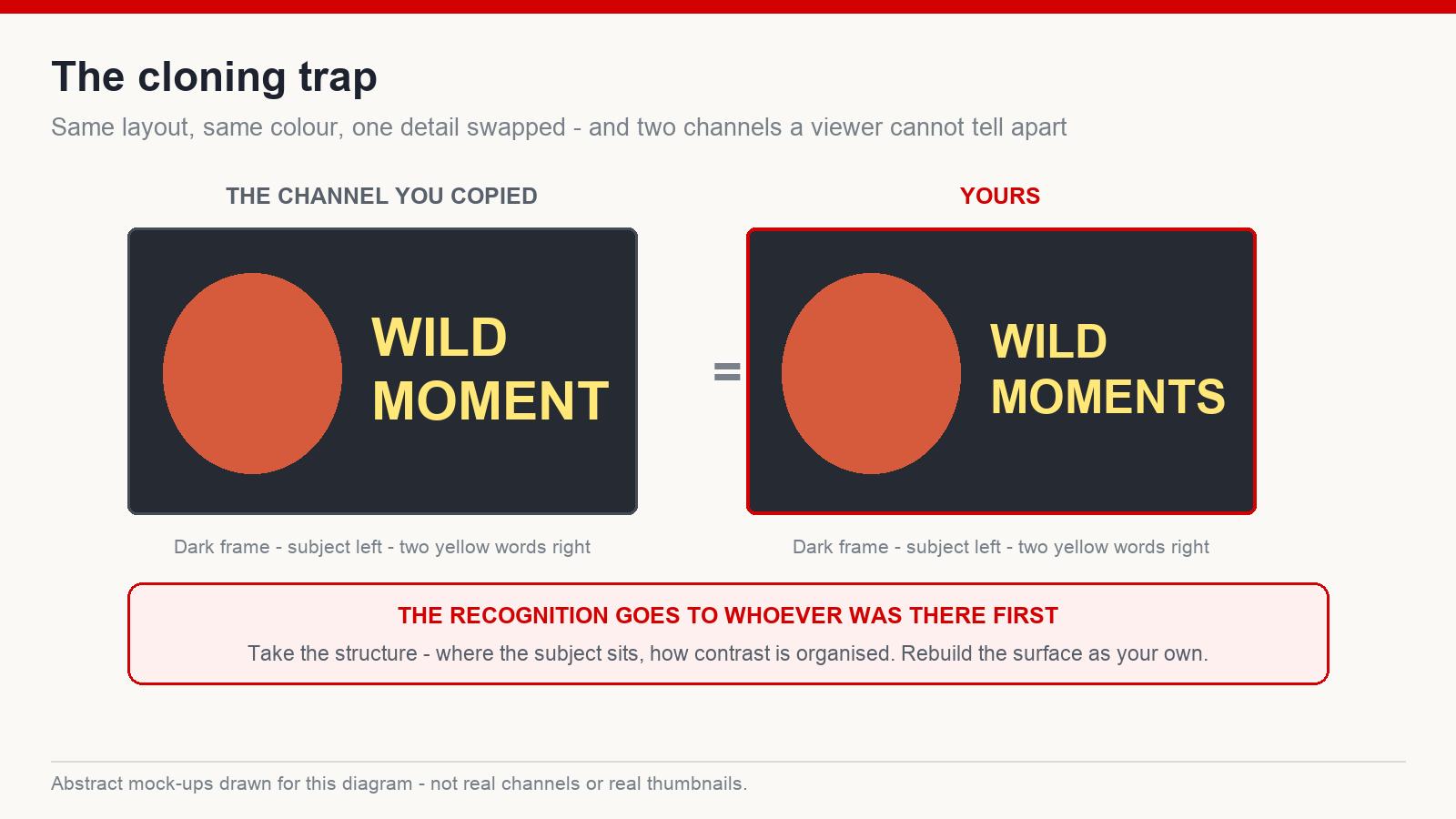
This is the most common mistake among new creators, and it comes from a reasonable instinct. You find a thumbnail that clearly worked, so you rebuild it: same layout, same colour, same pose, one or two details swapped, and you tell yourself that is different enough.
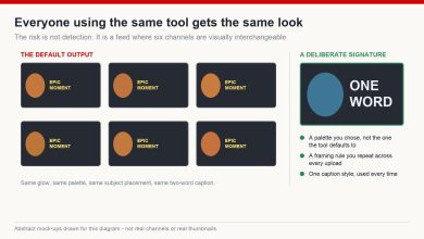
It is not. Two things go wrong. Viewers cannot distinguish your channel from the one you borrowed from, so recognition you earn leaks to them. And a channel whose whole shelf looks like somebody else’s has no visual identity to build on — every new upload reinforces their brand rather than yours.
What experienced creators actually take from a rival thumbnail is structural: where the subject sits, how much of the frame it occupies, how the contrast is organised, what emotion is being aimed at. Then they rebuild it with their own colour, their own layout habits, their own treatment. Familiar enough to be understood instantly, different enough to be remembered.
2. Nothing to Be Curious About
The fastest way to kill click-through rate is to be completely predictable. A viewer scanning a feed gives each thumbnail a second at most. If the image shows exactly what the title already said, and nothing is unresolved, there is no reason to stop.
What creates the pull is a small gap — something the image raises but does not answer. An unexpected object in a place it does not belong. A reaction without a visible cause. A before and after where the after is not explained. A situation the eye can read but the mind cannot finish.
The gap has to be real, though, which is the subject of mistake seven.
3. No Focal Point
Three lines of text, two subjects, a logo, an arrow, a busy background. Each element was added for a good reason and together they cancel each other out, because the viewer does not know where to look and does not have time to work it out.
Strong thumbnails are almost always simple: one main subject, one dominant emotion, one point of tension. That is not minimalism for its own sake — it is because the image has to be processed in a fraction of a second on a screen the size of a playing card. A single clear focal point makes that possible. Five competing ones do not.
4. Technically Fine, Emotionally Flat
This one is endemic on faceless and generated-image channels. The thumbnail is well composed, correctly lit, professionally rendered — and it makes the viewer feel nothing, so they scroll past it without a decision being made at all.
Emotion is what converts attention into a click: surprise, tension, fear, curiosity, delight, anticipation. The much-copied bright, high-contrast style associated with the biggest creators does not work because of the colours. It works because the emotional state in the frame is legible from across the room. If your subject is a landscape or an object rather than a face, the emotion has to come from the situation instead — scale, danger, contrast, something out of place.
5. Designed on a Desktop, Viewed on a Phone
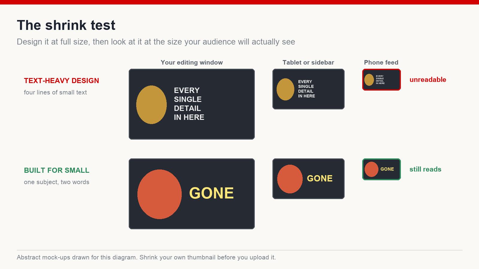
The most underrated failure of all. You design at full size on a large monitor, where everything is legible and the detail looks rich. Most of your audience will see that image at a fraction of the size, on a phone, while moving.
The test takes ten seconds. Shrink the thumbnail until it is roughly the size it appears in a mobile feed, then look at it. Can you tell what the subject is? Can you read the text, if there is any? Does the emotion still come through? If any answer is no, the thumbnail does not exist for most of your viewers.
Practical consequences: fewer words and bigger ones, a subject that occupies a serious share of the frame, and contrast strong enough to survive being shrunk. Fine detail is decoration for an audience that will never see it.
6. Cheap-Looking, or Over-Edited Into Plastic
Two opposite failures with the same result: the viewer decides, before they can articulate why, that this is not a channel worth their time.
On the cheap side: flat colour, obviously artificial lighting, warped details, garbled text baked into a generated image. Generated art in particular needs checking — the artefacts that give it away cluster in hands, small objects and any lettering, and a thumbnail with a misspelled word rendered into it does more damage than no thumbnail at all.
On the over-edited side: saturation pushed until skin looks like plastic, glow on everything, a composite so aggressive that no part of the image reads as real. It signals the same thing the cheap version does — that the production is not careful.
Whatever tools you use, the finished image should look deliberate. Not necessarily photographic, not necessarily expensive. Deliberate.
7. A Promise the Video Does Not Keep
The dangerous one, because in the short term it looks like a win. An exaggerated thumbnail can lift clicks. Then those viewers arrive, discover the video is not what the image implied, and leave within seconds. Distribution follows what happens after the click, not the click itself.
Worth saying plainly: a high click-through rate is not automatically good news. A thumbnail that pulls clicks while retention collapses produces a worse outcome than a modest thumbnail on a video people finish. The two numbers have to be read together, and they only mean something relative to your own recent videos — take the median of your last ten uploads and compare against that, rather than against a benchmark from a blog post, because what counts as normal varies enormously by niche and format.
The goal is not to avoid curiosity. It is to create curiosity the video actually resolves.
What a Working Thumbnail Contains
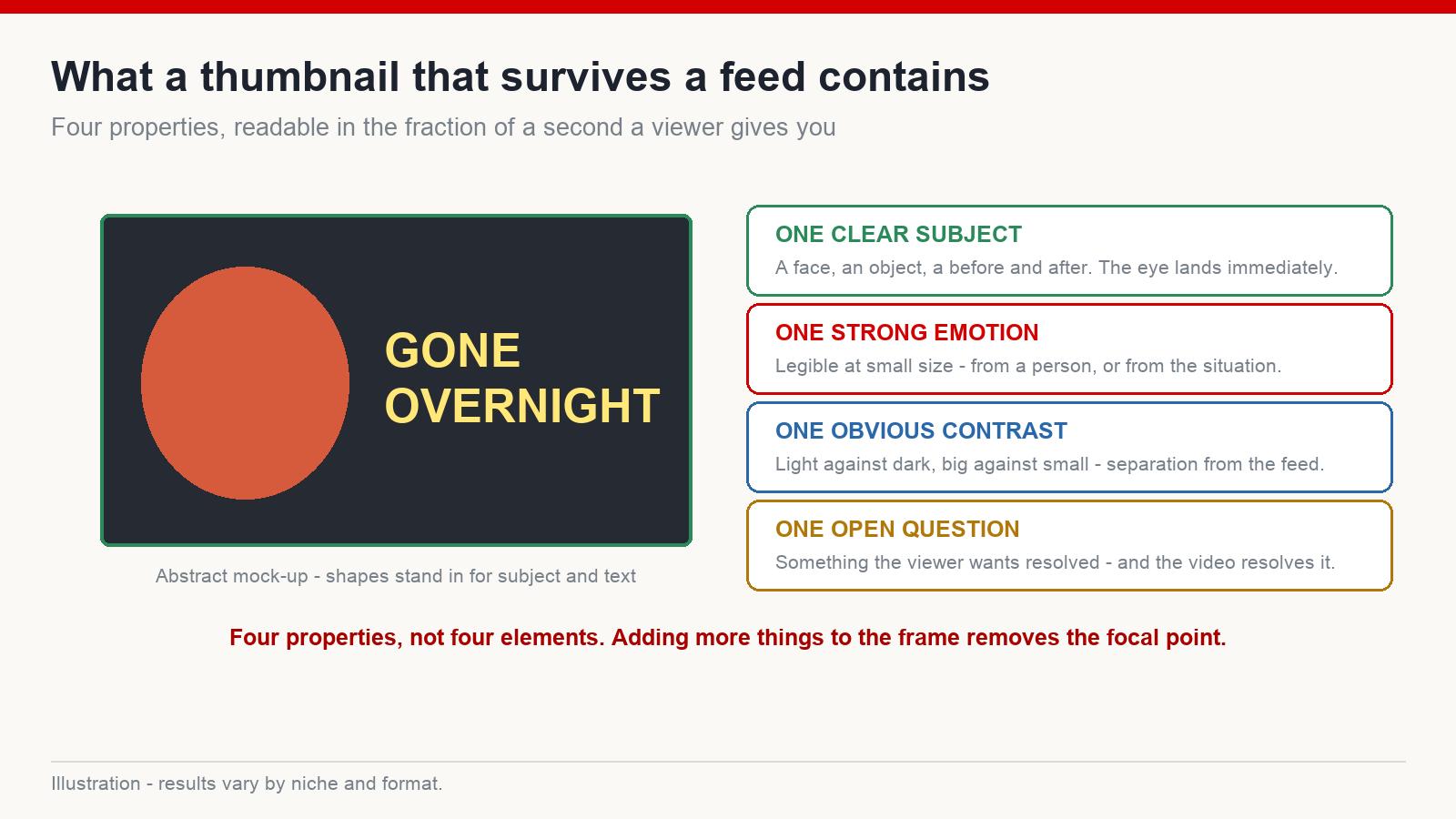
Across niches, the images that hold up tend to share four properties:
- One clear subject — a face, an object, a before-and-after, something the eye lands on immediately.
- One strong emotion — legible at small size, whether it comes from a person or from the situation.
- One obvious contrast — light against dark, big against small, before against after. Contrast is what separates the image from the feed around it.
- One open question — something the viewer wants resolved, which the video then resolves.
The Pre-Upload Check
Two minutes before you publish:
- Shrink it to phone size. Is the subject still readable? Is the text still readable?
- Is there one focal point, or several competing ones?
- Does anything in the frame make a viewer want to know more?
- Does the image promise what the video delivers in its first minute?
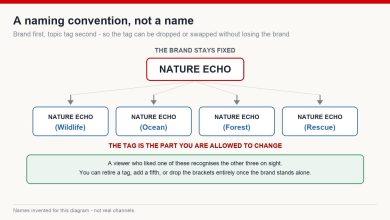
- Put it next to your last five thumbnails. Does it look like the same channel — and does it look like a channel, rather than like everyone else in the niche?
- Check any text and small details for artefacts, especially in generated images.
Frequently asked questions
Do AI-generated thumbnails get less reach? How an image was made is not the issue. Whether it is misleading, low quality or a clone of somebody else’s packaging is.
What click-through rate should I aim for? There is no universal number worth chasing — it varies too much by niche, format and traffic source. Compare against the median of your own recent uploads instead, and read it alongside retention.
How much text belongs on a thumbnail? Less than you think. A few large words that add something the image cannot say. If the text repeats the title, delete it.
Should I change the thumbnail on an old video? Yes, it is a normal and useful experiment. Change one thing at a time, give it enough time to gather data, and write down what you changed so the result teaches you something.
The Short Version
The thumbnail is the packaging on the product. Stop asking whether it looks nice and start asking whether it would stop you mid-scroll on a phone — and whether the video pays for the promise it makes. Results vary by niche and platform behaviour changes, so treat every one of these as a hypothesis to test against your own numbers.
If you are building faceless channels for English-speaking audiences and want the rest of the packaging system in one place, that is what I write about at mmoyoutube.com.