Your Thumbnail and Title Are One Unit. Most People Write the Message Twice.
Watch someone package a video and you will usually see this order: write the title, then build a thumbnail that shows the title. The image says what the words already said. The words say what the image already showed.
Two slots, one message. Which means one slot did nothing.
I have been building YouTube channels since 2017, most of that on faceless channels aimed at English-speaking audiences, and packaging is the part of the job I get asked about most. The thing that changes results is rarely a better image or a cleverer line in isolation. It is treating the YouTube thumbnail and title as one unit with two halves — and then dividing the work between them deliberately.
Two Slots, Two Different Jobs
The image and the line are not competing for the same job. They happen at different moments and they are answering different questions.
The image works first, and it works pre-verbally. Its job is to interrupt a scroll: to be the thing that makes someone slow down for a fraction of a second before they have read anything. It trades in contrast, an unresolved situation, a scale that does not fit.
The line works second, and only for people the image already stopped. Its job is different: it supplies context. What is this about, who is it for, and what will I get. The image earns the pause. The line converts it.
Once you hold those apart, the redundant pairing becomes obviously wasteful. A picture that spells out the title has spent the first slot repeating the second, and the viewer arrives at a complete idea with nothing left to open.
Four Ways a Pair Fails
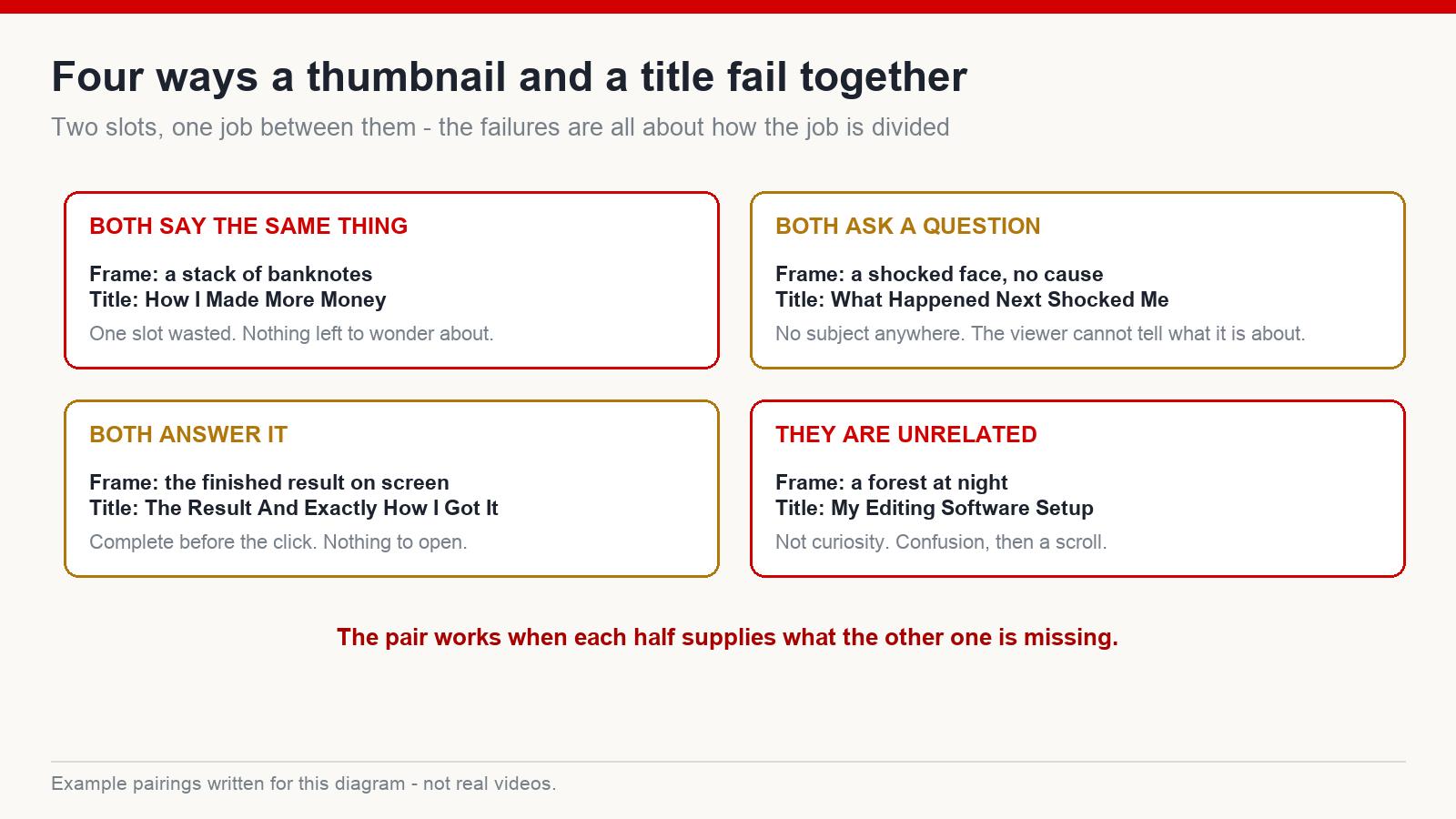
Every bad pairing I have looked at falls into one of four shapes:
- Both say the same thing. The frame is an illustration of the sentence. The most common failure by a wide margin, and the easiest to fix.
- Both ask a question. A reaction with no visible cause, paired with a line that also refuses to name the subject. Now nothing tells the viewer what territory they are in, and unidentified content does not get clicked.
- Both answer it. The image shows the finished result and the line explains how it was reached. The idea is complete before anyone has clicked anything.
- They are unrelated. The frame belongs to a different video from the line. This does not read as intrigue, it reads as an error, and the viewer moves on.
Notice that two of these are failures of too much information and two are failures of too little. There is no rule of thumb like “withhold more.” The pair has to add up to one complete-but-open idea.
Four Divisions That Work
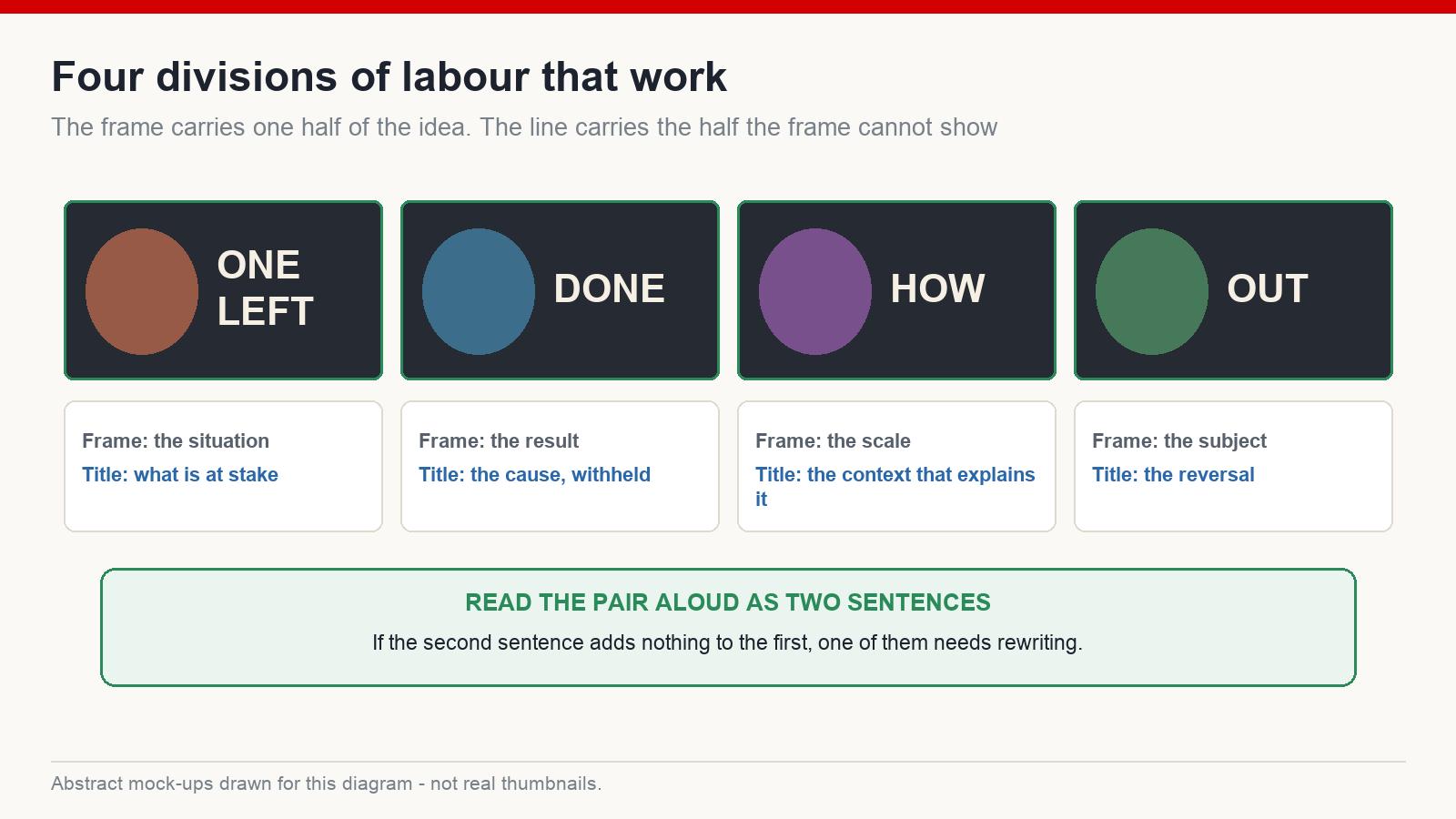
These are the splits I keep coming back to. They are not templates so much as ways of deciding who carries what.
- Frame shows the situation, line names the stakes. The image puts you somewhere; the words tell you what is at risk there.
- Frame shows the result, line withholds the cause. You see the outcome and want to know what produced it — provided the video actually says.
- Frame shows the scale, line supplies the context. Something implausibly large or small in the image, and a sentence that explains what you are looking at.
- Frame shows the subject, line carries the reversal. A clean, legible subject with a line that contradicts what you would assume about it.
In every one of those, each half is supplying exactly what the other cannot. That is the whole design principle.
Build the Image First
The order matters more than it looks. When the title is written first, the thumbnail almost inevitably becomes an illustration of it — you have already fixed the message in words, and the image ends up decorating them.
When the image comes first, it sets an emotional direction, and the title has room to do the job the image cannot. You look at the frame and ask: what does someone seeing this not know? Then you write that. It is a much better question than “how do I say this again in words.”
The Read-Aloud Test
Before uploading, read the pair as two sentences, out loud. First describe what the image shows. Then read the title.
If the second sentence adds nothing to the first, you have a redundant pair and one of the halves needs rewriting. If, after both sentences, you still could not say what the video is about, the pair has withheld too much. And if you can say exactly what happens in the video, you have closed it — there is no reason left to click.
What you want is the state in between: you know what it is about, and there is one specific thing you do not know yet.
Where the Visual Style Fits
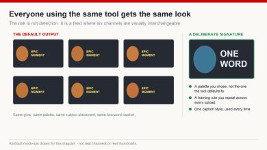
A cinematic or heavily rendered look can genuinely help a tile separate from the surrounding grid, particularly in documentary and storytelling niches where everything around it is flat and photographic. Worth knowing, and worth not overrating: style controls how visible the tile is, not what it says. A polished frame with no unresolved question in it is a well-lit dead end. Solve the pairing first, then decide how it should look.
The Promise Belongs to the Pair
One thing worth being blunt about. The promise a viewer perceives is made by the image and the line together, not by either one on its own. A title that is technically accurate paired with a frame implying something more dramatic still overpromises, and the viewer does not evaluate them separately.
That matters because overpromising is not a neutral trade. It raises the click rate and lowers retention, and retention is what decides whether the video keeps being distributed. A pair that is slightly less exciting but entirely honest tends to outlast one that wins the first hour.
The Check Before You Upload
- Say what the image shows in one sentence, then read the title. Does the second add something new?
- Can you name what the video is about after seeing both?
- Is there exactly one thing still unresolved?
- Shrink the frame to phone size. Does the subject still read?
- Does the video contain what the pair, taken together, implies?
The Short Version
Stop writing the message twice. The image stops the scroll, the line converts the pause, and the two together should leave one specific question open. Build the image first, divide the labour on purpose, read the pair aloud, and make sure the video can honour what they promise between them.
Measure the result against the median of your own last ten uploads rather than any figure from elsewhere, read the click rate alongside retention, and change one half at a time so you can tell which one moved. Results vary by niche and format.
If you want the full workflow around packaging and the production system behind it, that is what we work through at mmoyoutube.com.
FAQ
Which matters more, the thumbnail or the title?
They do different jobs at different moments, so ranking them is not that useful. The image decides whether anyone slows down; the line decides whether the pause turns into a click.
Should the thumbnail contain text?
It can, if the text is short and adds something the title does not. Repeating the title inside the frame is the redundant pairing in its most literal form.
Which should I make first?
The image, in most cases. Writing the title first tends to produce a thumbnail that merely illustrates it.
How do I know whether the pair is working?
Compare against your own recent uploads rather than a published benchmark, and read the click rate together with retention. A pair that lifts clicks while retention sags has cost you more than it gained.