Why Rendered Thumbnails Separate From a Feed, and When They Stop Working
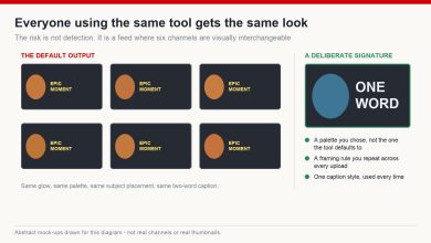
Open YouTube on a phone and count what your eye actually lands on. Not what you click — what it lands on. Somewhere between six and twelve thumbnails are competing in that first screen, most of them photographic, most of them mid-tone, most of them showing a person or a scene at a comfortable distance. They average out into wallpaper.
Then there is one that does not. Usually it is lit like a film still: a single subject carved out of the background, hard light on one edge, deep shadow behind it. That style — people call it a 3D render, though the label matters less than the look — has become common on faceless, documentary and storytelling channels for a reason that has very little to do with it being modern.
What People Mean by a Rendered Thumbnail
The vocabulary is loose, so let me be specific about what I am describing: an image that looks sculpted rather than photographed. Strong directional light, visible depth between subject and background, clean edges, saturated but controlled colour, and a subject that has clearly been placed rather than caught.
It can come out of a 3D package or an image generator. The production route is not the interesting part. The visual grammar is.
The Viewer Never Names the Style
This is worth saying plainly, because creators get precious about technique. No viewer has ever thought “ah, a render” while scrolling. What happens is much smaller and much faster: their eye stops for a fraction of a second longer on one image than on the ones around it.
Everything below is an attempt to explain why that fraction of a second happens, and it is all mechanism — not a promise about your numbers.
Four Things the Style Actually Buys
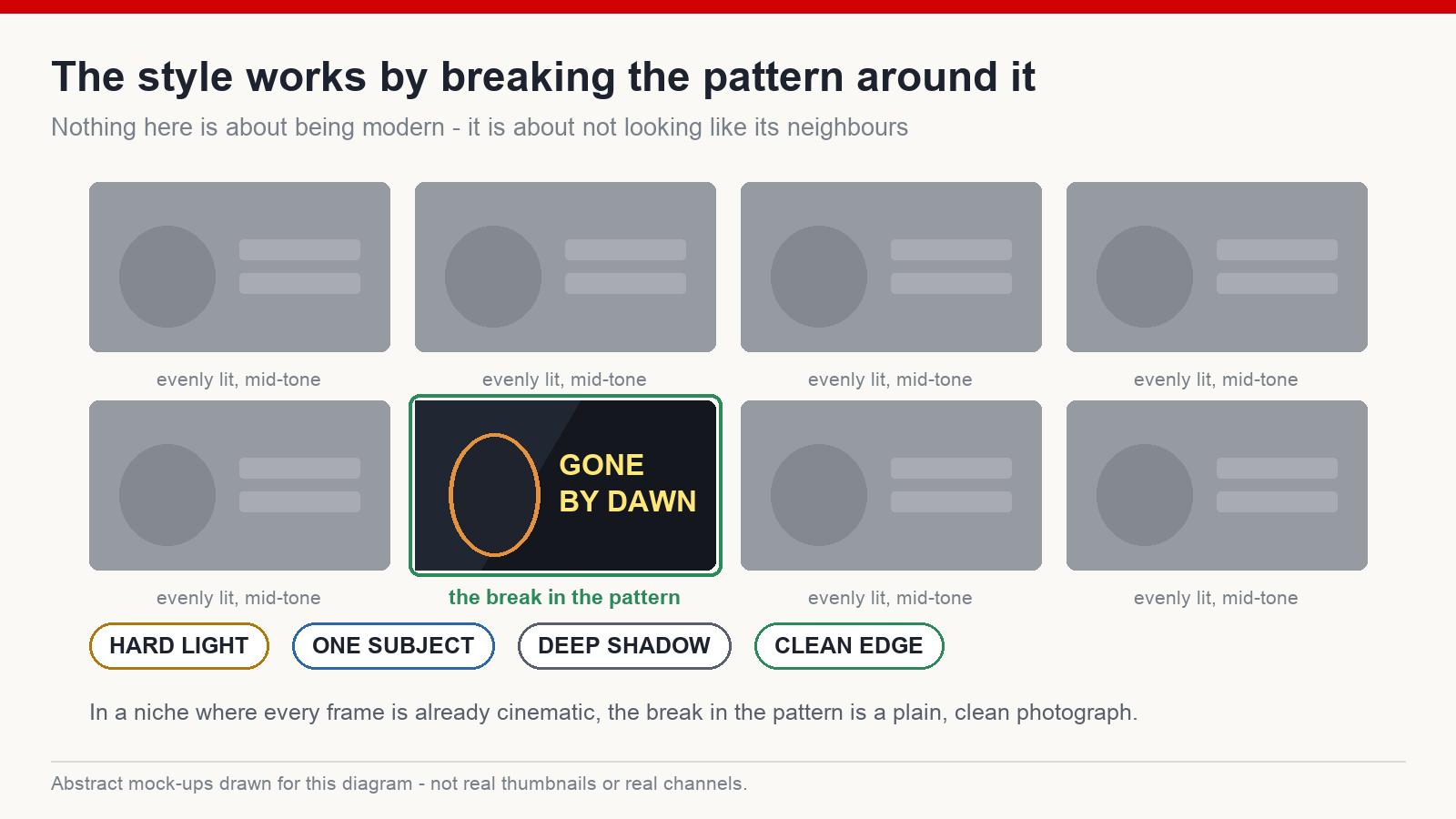
Separation. A feed is a pattern, and the eye is built to notice breaks in patterns. In a column of evenly-lit photographs, a frame with hard light and deep shadow is a break. Notice the dependency in that sentence: the effect comes from being different from its neighbours, not from being rendered. In a niche where every thumbnail is already cinematic, the break is a plain, clean photograph.
Legibility at the size people actually see it. This is the underrated one. A rendered frame usually carries a strong silhouette and a single obvious focal point, and those two properties survive being shrunk to the width of a thumbnail on a phone. Fine detail does not survive. Contrast does.
Perceived effort. People judge what a video will be worth from its packaging, the same way they judge a book from its cover before reading a word. A frame that looks deliberately lit and composed reads as a video somebody cared about. That is a real effect, and it is also a debt — the video then has to be worth the impression.
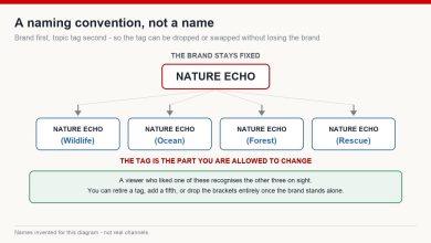
A look you can repeat. Consistent lighting, palette and composition means that after twenty videos a returning viewer recognises your thumbnails before they read the channel name. That compounding is worth more over a year than any single frame.
Three Ways It Goes Wrong
The style is not self-executing. Most of the rendered thumbnails I see fail, and they fail in the same three ways.
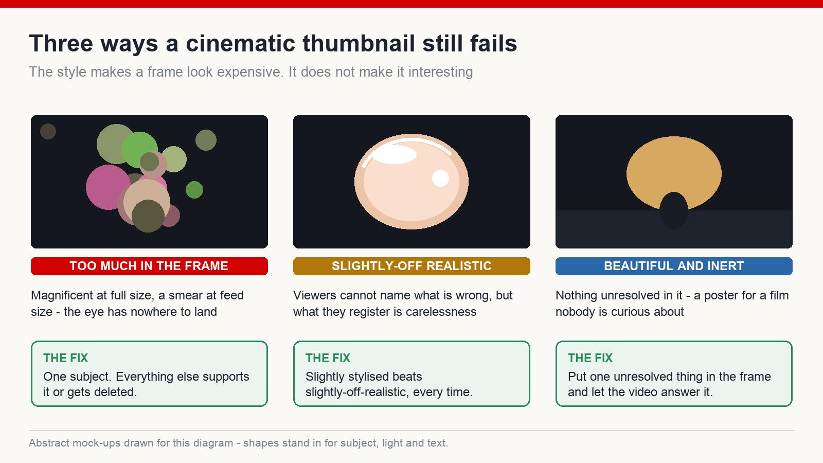
Too much in the frame. Generators are happy to fill every pixel with interesting things. The result looks magnificent at full size on your monitor and turns into a smear at feed size, because there is no single place for the eye to land. One subject. Everything else supports it or gets deleted.
The plastic problem. Skin like vinyl, eyes lit from nowhere, hair that behaves like a solid object, that particular over-processed sheen. Viewers cannot always articulate what is wrong, but they register it, and what they register is carelessness. Slightly stylised beats slightly-off-realistic every time.
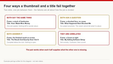
Beautiful and inert. The most common failure by a wide margin. A gorgeous cinematic frame with nothing unresolved in it. There is no tension, no question, nothing about to happen — it is a poster for a film nobody is curious about. A rendered style makes a thumbnail look expensive. It does not make it interesting.
How I Actually Build One
The order matters more than the tool.
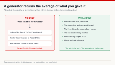
First, decide the moment. Before generating anything, I write one sentence describing the instant the thumbnail shows — not the topic, the instant. “The second before the door opens.” If I cannot write that sentence, generating images is just shopping.
Then look at what already exists in the niche. Not to copy the composition, but to find out what the feed already looks like, so I know which direction is the break in the pattern.
Then write the prompt around light and composition, not just content. Something on the order of: a lone figure at the edge of a frozen lake at dusk, seen from behind, low sun behind them, strong rim light, deep shadow foreground, cinematic lighting, high contrast, uncluttered background. The content words are the easy half. The light and composition words are what make it read small.
Then make variations and throw most away. Different crops, different distances, different intensities. First outputs are rarely the best ones and the marginal cost of another is almost nothing.
Then shrink it. Scale the candidate down to roughly the size it will appear on a phone and look at it beside real thumbnails. If you cannot tell in one second what the subject is and what is happening, the frame has failed regardless of how good it looks at full size.
Where the Rules Come Into This
Two boundaries worth knowing before you build a channel on the style.
The first is originality. Rebuilding a competitor’s exact composition, palette and layout is not a shortcut — it is a way of donating your click to whoever the viewer already recognises, and repeated closely enough it starts to look like the kind of imitation platforms act on.
The second is realism. A stylised render nobody would mistake for a photograph is straightforwardly fine. A photorealistic image of an event that never happened, presented as though it did, is a different conversation entirely, and that conversation involves disclosure rules and misleading-content policy rather than design taste.
How to Tell Whether It Worked
I cannot give you a benchmark number, and I would distrust anyone who does — click-through rates vary wildly by niche, video length, traffic source and channel size, and a number from someone else’s channel tells you nothing about yours.
What you can do is compare against yourself. Take the median click-through and views of your last ten videos as your baseline, run the new style across five or eight uploads rather than one, and compare the two groups. Watch retention at the same time: a frame that overpromises will lift clicks and lose the viewer in the first thirty seconds, which is a worse outcome than being ignored. Seasonality, subject and luck all move these numbers, so treat the comparison as a signal, not a verdict. Results vary.
The Short Version
- The style works by breaking the pattern of the feed around it, so read the feed first
- Strong light and a clean silhouette survive being shrunk; fine detail does not
- One subject, one focal point, everything else deleted
- Slightly stylised beats slightly-off-realistic
- A cinematic frame with nothing unresolved in it is still an inert thumbnail
The competition on a feed was never about which image is the most beautiful. It is about which image stops a thumb that was already moving. A rendered style is one good way of doing that — as long as you remember that the look buys you the pause, and something unresolved inside the frame is what buys you the click.
Does this style suit every niche?
No. It fits storytelling, documentary, mystery, gaming and faceless formats naturally. On channels built around a real person, trust and familiarity do more work than cinematic lighting, and a rendered look can read as distancing.
Does the render need to look photoreal?
Usually the opposite. Clarity and emotion carry further at small size than realism does, and pushing towards photoreal is exactly where the uncanny plastic problem starts.
Will YouTube treat AI-made thumbnails as spam?
Making a thumbnail with generative tools is not itself a problem. Mass-cloning someone else’s packaging, or promising something the video does not contain, is — and that would be true whatever tool produced the image.
Should I put text on a rendered thumbnail?
If you do, keep it to two or three large words. The whole advantage of the style is legibility at small size, and a sentence across the frame throws that advantage away.
If you want the whole packaging workflow — niche research, titles and thumbnails built for an English-speaking audience — that is what I teach at mmoyoutube.com.